Pinkoi Brand Identity Refresh
My Role
Project Owner & Design Director
Project Planning & Strategy.
Project Management, Facilitation & Execution.
Design & Art Direction.
Web UI refresh.
Team
4 Product Designers, 2 Visual Designers,
4 Developers, 1 User Researcher, 3 Copywriters
Duration
Jan 2019 - July 2019
Backgroud
As a former Silicon Valley engineer, Peter saw the passion that his friends had for creating lifestyles, and for the first time, he felt lost. However, he began to figure that he admired how great design could be used to create lifestyles. He liked to chat with designers when checking out craft fairs and small shops. Not all of them came from professional design backgrounds, but they all had a certain persistence and attitude that he found particularly captivating.
There were so many great designs that only received a limited amount of exposure due to location and time constraints. Wanting to give these designs more exposure, Peter found Mike and Mai, and together, the three of them created Pinkoi.
To date, there are over 10,000 design brands that have joined Pinkoi, with designers coming from all over the world. Anyone with a design dream can help others to achieve their own unique lifestyle vision. Lifestyle visions that are not limited to any gender, style, ethnic group, or background.
Problem
As Pinkoi continues to grow, we got to the point where we hoped to be able to design a new logo that could better convey the meaning of these unique lifestyle visions. We wanted a logo that was more neutral, minimal, and international. A logo that could express our core spirit of inclusiveness, diversity, and respect for the unique. This is why we began the process of refreshing the Pinkoi brand.
Process
Our entire staff participated in this process. We held workshops to identify and define the core spirit of our brand. We rated visual identity proposals. We invited designers and users to participate in visual identity tests and interviews. Until finally, the new Pinkoi brand and visual identity were revealed, thanks to the collaborative efforts of our product team and the entire Pinkoi staff.
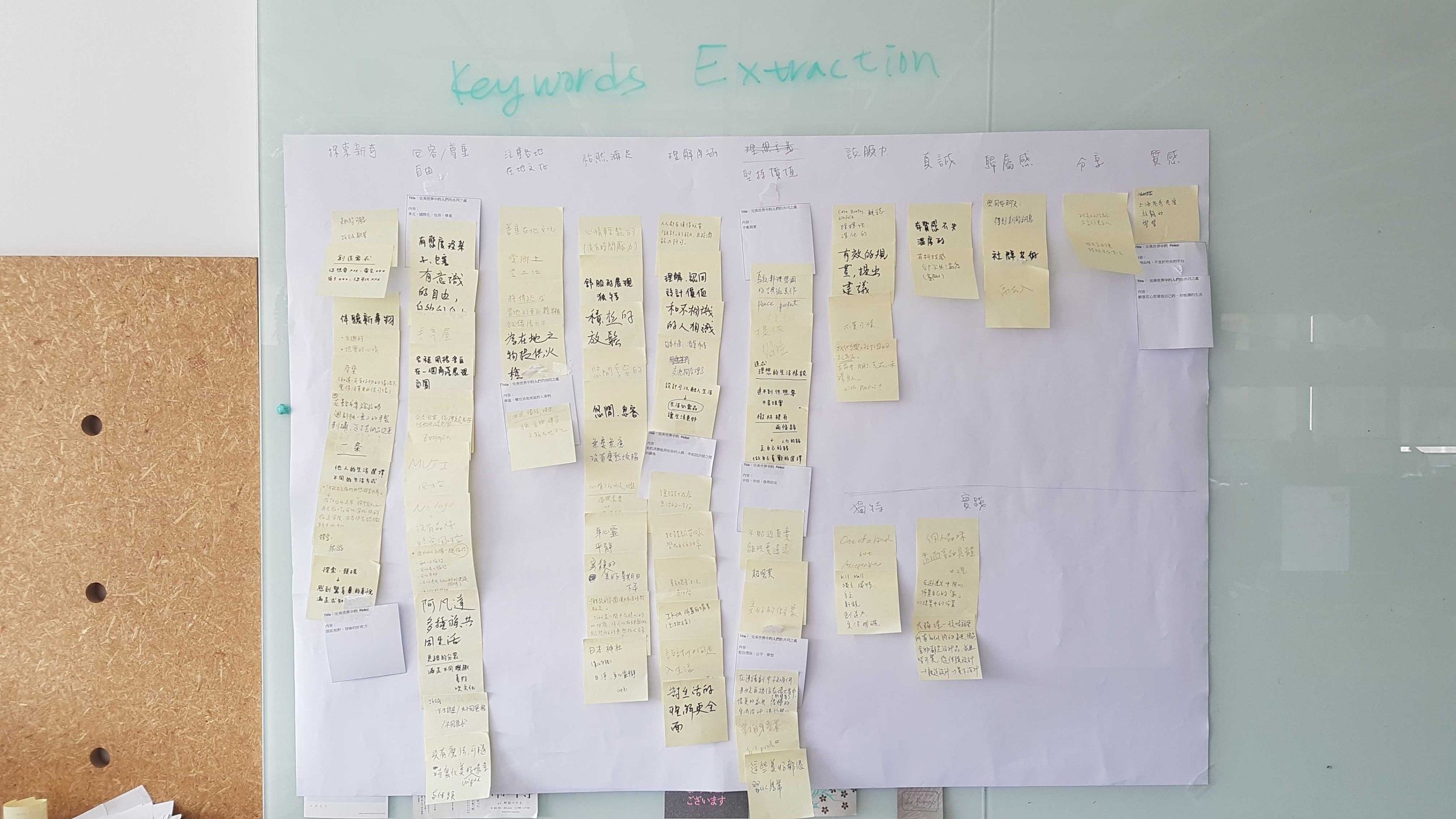
Brand Keywords of Pinkoi Workshop
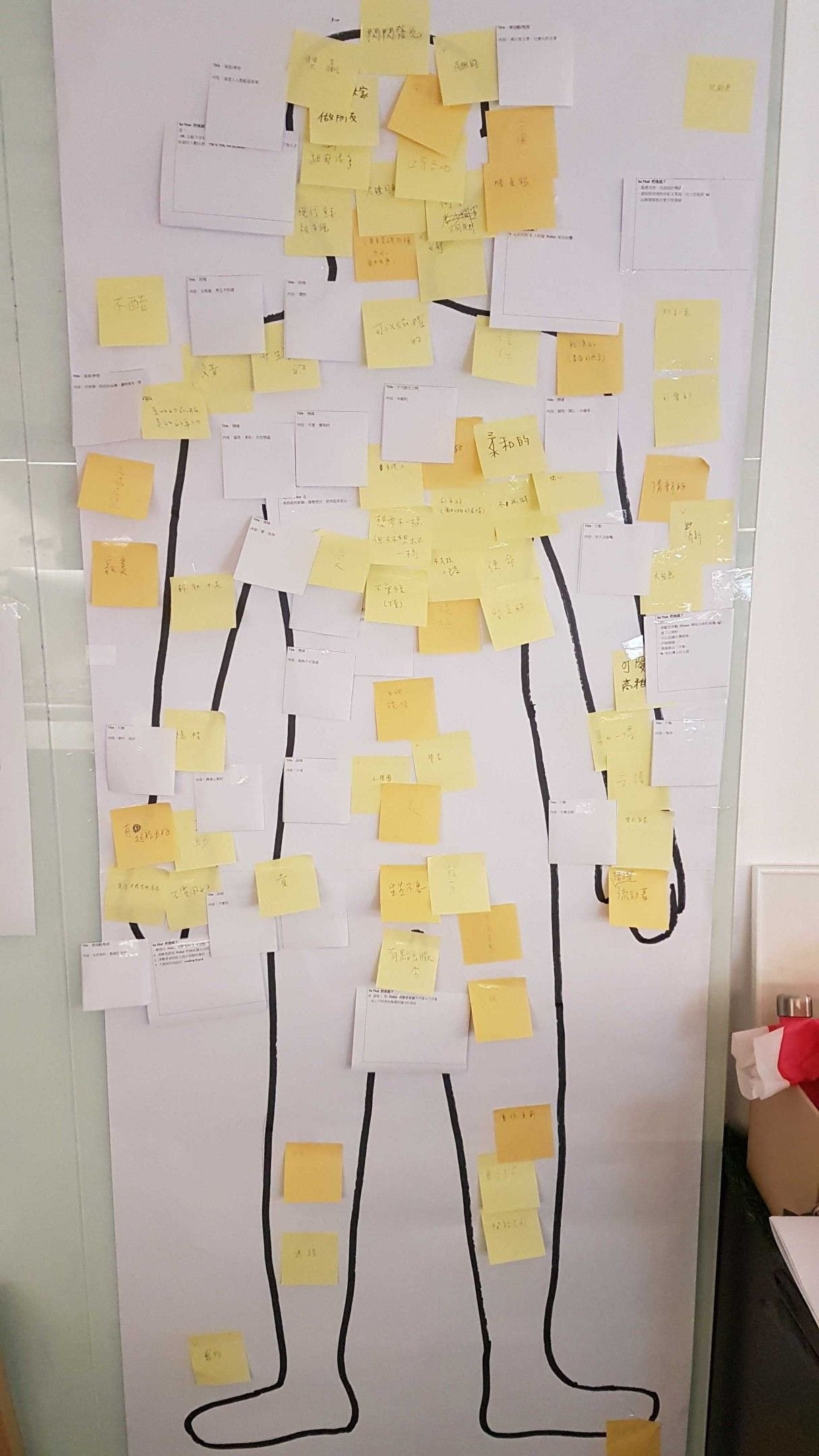
Profile of the present Pinkoi workshop

Internal workshop

Brand identity proposal user testing
Formal Pinkoi logo
New Pinkoi Logo
Solution
Inclusiveness, exploration, creation
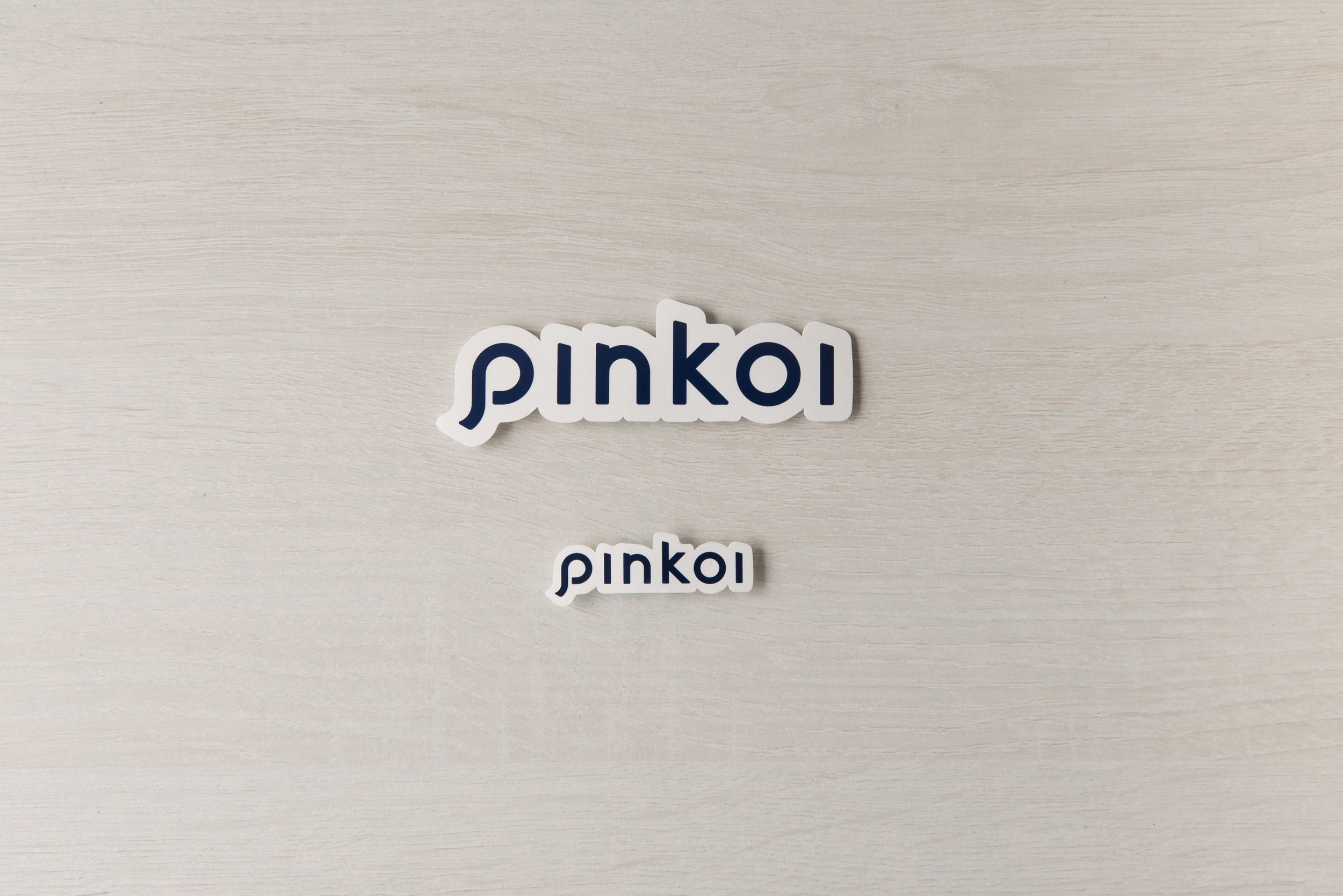
Our new logo symbolizes inclusiveness, using a complete circle to form the backbone of the design while cleaning up the rather complex lines of the previous logo. The new logo also makes use of a unique diagonal stroke cap, similar to a powerful beam of light from a searchlight, which symbolizes the process of exploring great design and discovering lifestyles. Furthermore, on top of a solid, squared foundation, the curved lines of the logo symbolize the possibility of creation from imagination.
From the complex to the simple, from imagination to exploration, from exploration to discovery
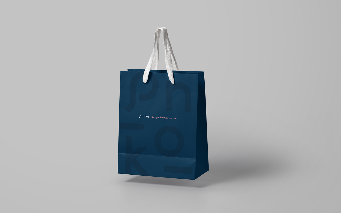
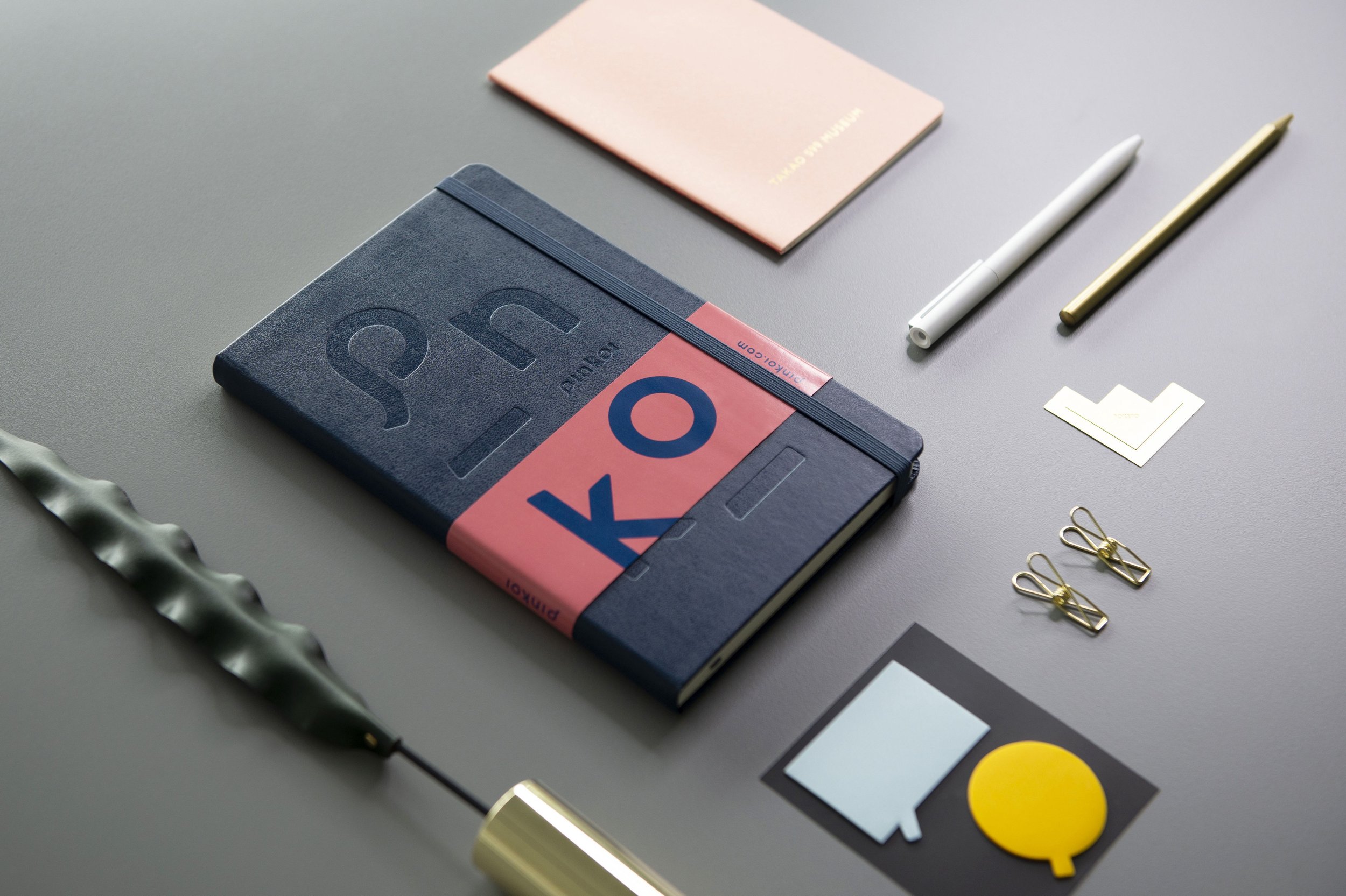
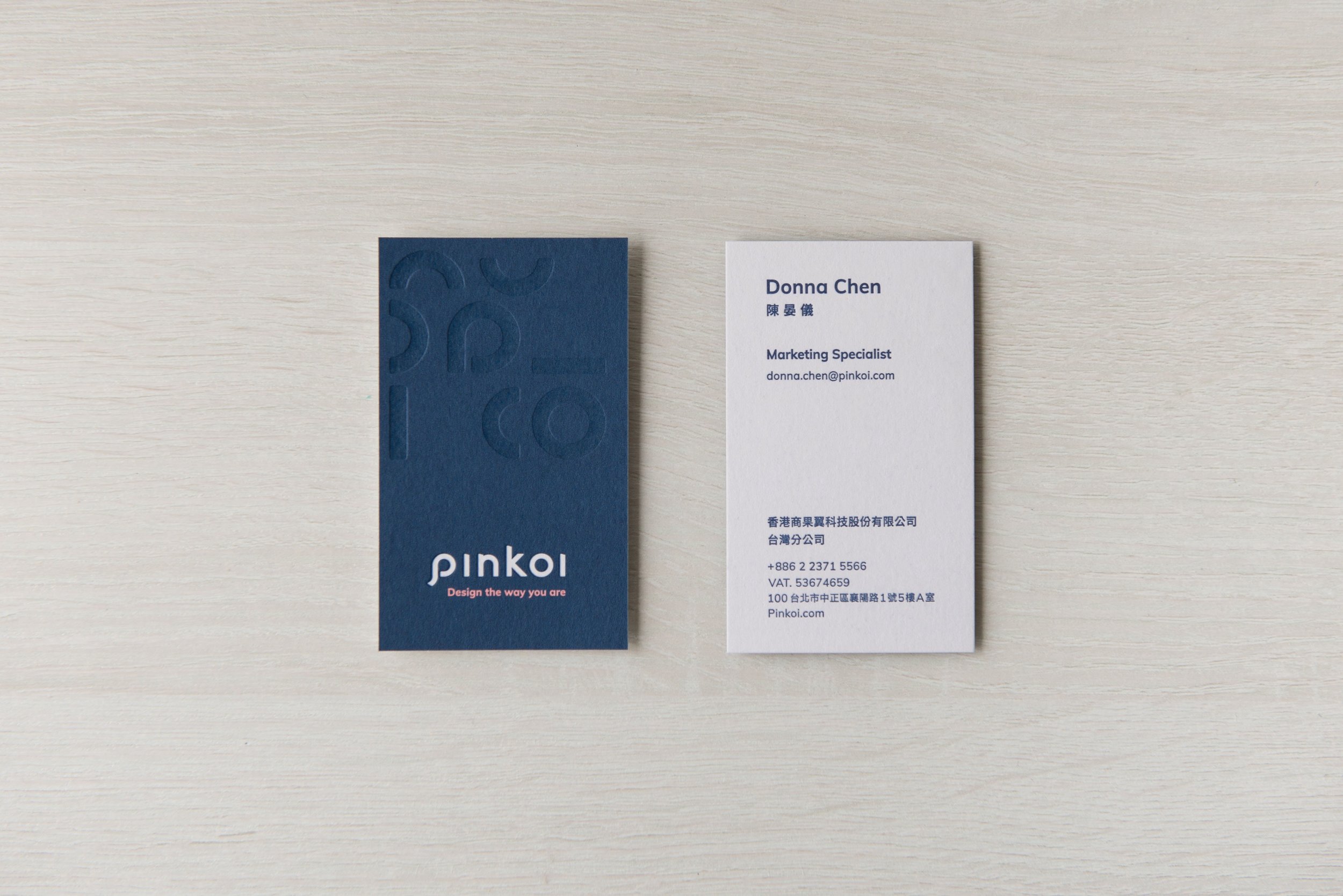
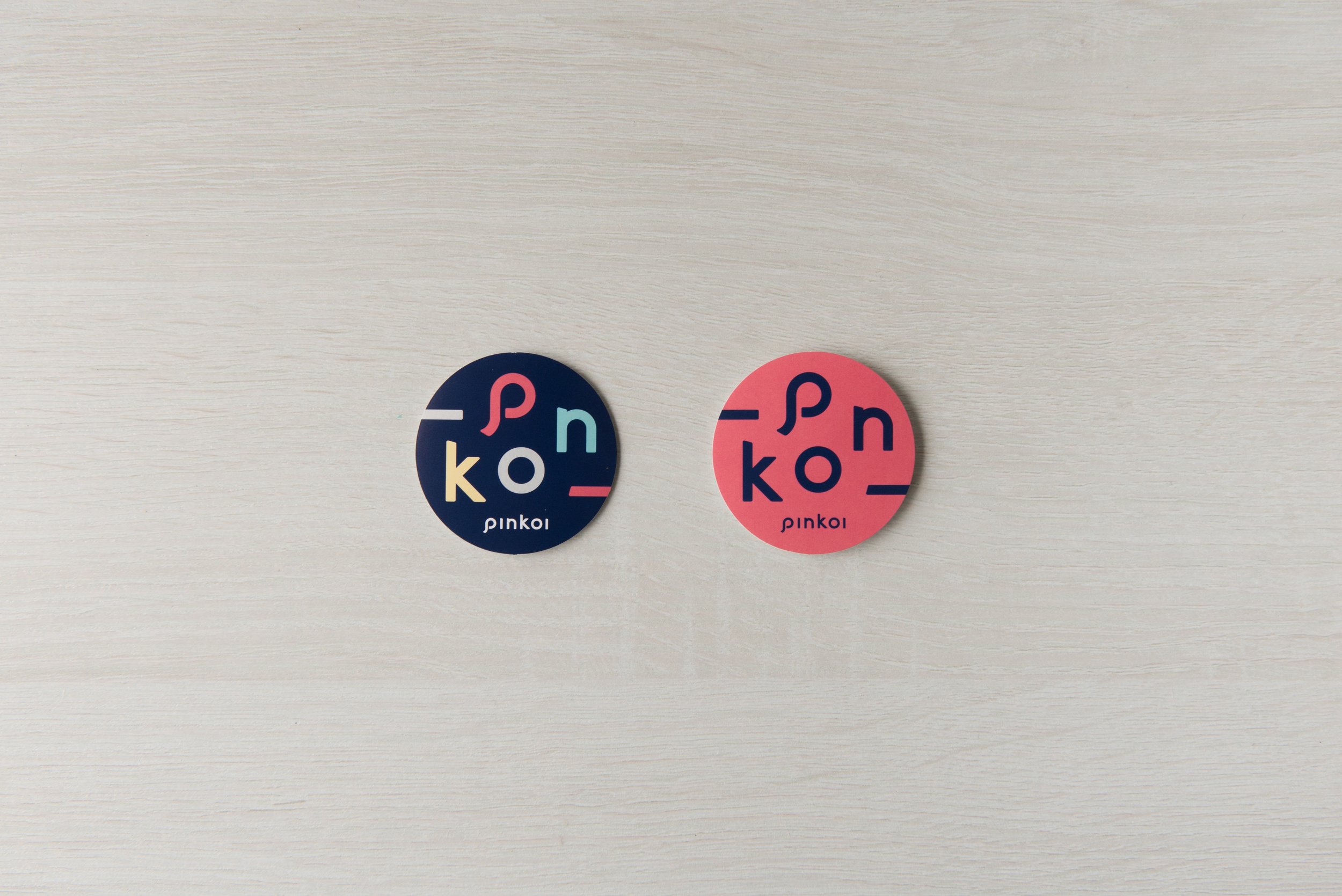
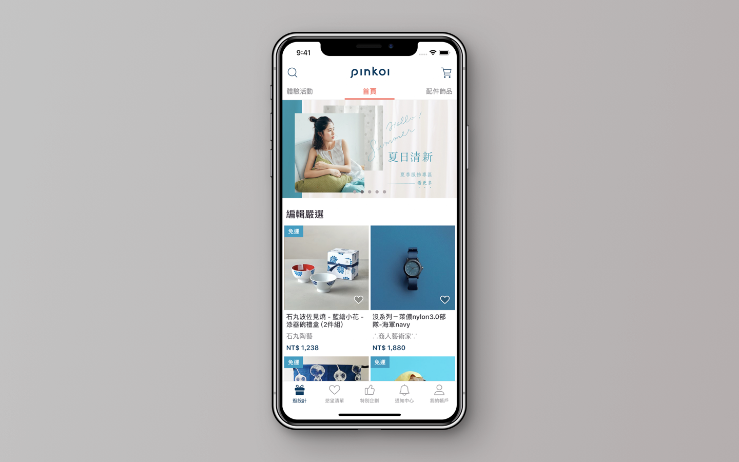
The new color palette features navy blue as the new brand color, replacing the original pink color which easily gave people the impression of a specific style. It trumpets Pinkoi’s transformation, allowing Pinkoi to be more inclusive and accommodating of different styles.
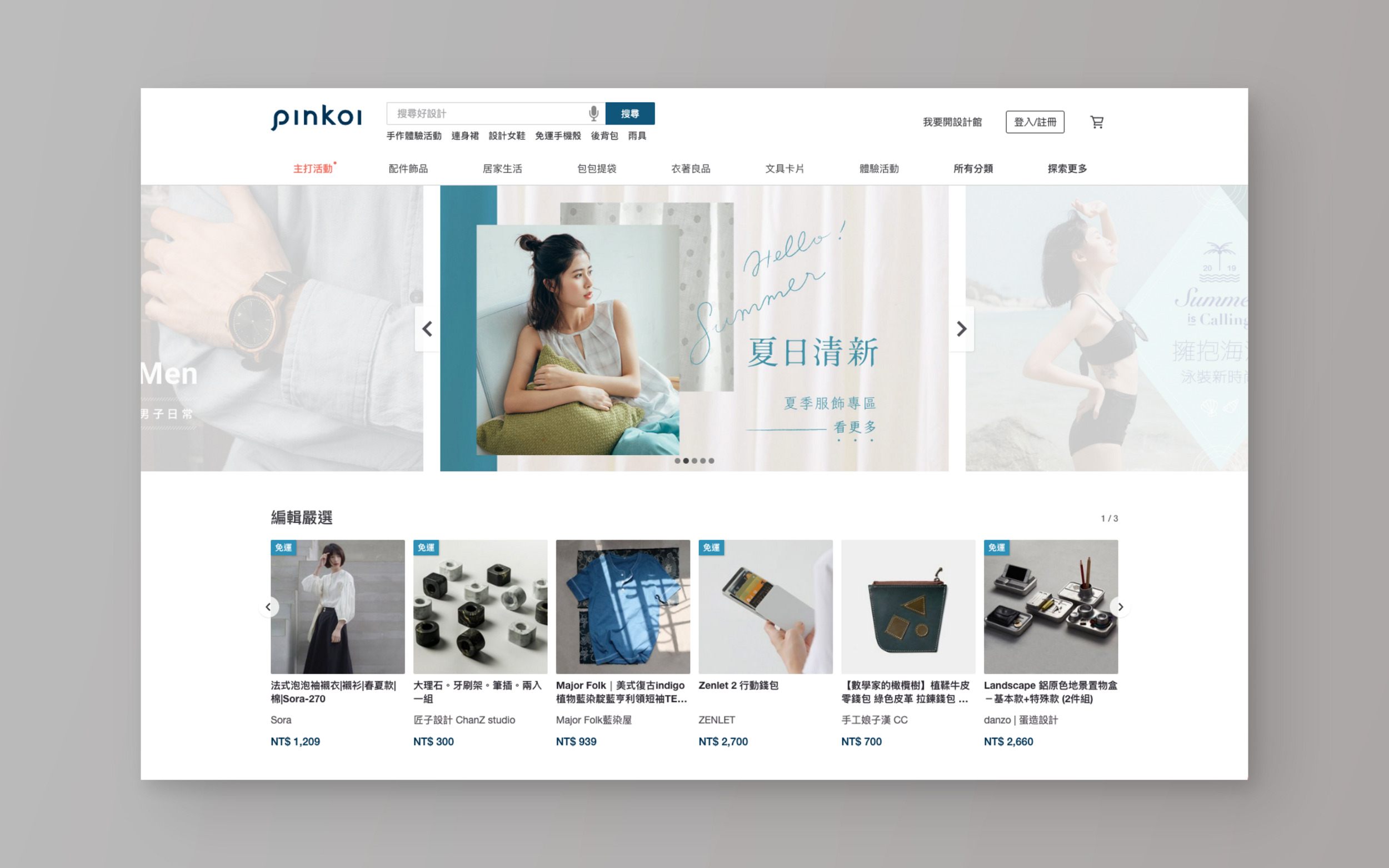
Supplementary colors such as salmon allow Pinkoi to maintain a unique personality in the midst of the calm and stability represented by the navy blue. The overall visual design emphasizes Pinkoi’s brand image using a more minimal combination of geometric shapes and lines. It emphasizes professionalism and internationalism while also creating more flexibility in application.

Outcome
The new brand identity provides a better foundation for Pinkoi, revealing a new appearance and experience. It is better able to help each person find their own unique style at Pinkoi. It declares Pinkoi’s determination to enter into the next stage of its evolution: Striving to break away from market conventions to create the ideal design ecosystem and helping designers to realize their dreams on an international scale.


